IRONPLAST: a double-sided totem that enhances industrial identity
The ZIPPOPIU project for Ironplast
ZIPPOPIU has created a new double-sided totem for IRONPLAST SRL , a company located in the heart of the industrial area of Lumezzane (BS) .
A complete project: from graphic design , to printing and adhesive application , up to the final installation .

A strategic position for maximum visibility
The totem was installed along the main road of the industrial area, a constant passage point for heavy vehicles, customers and suppliers.
Thanks to its height and positioning , the totem guarantees visual impact and immediate recognisability .

Bright colors and perfect readability
The choice of colors was studied to be consistent with the corporate identity and at the same time highly visible:
- Deep blue as the main color
- White for text and directional arrows
- Red for the IRONPLAST logo, highlighted
All graphics have been precisely applied for a clean, long-lasting finish.

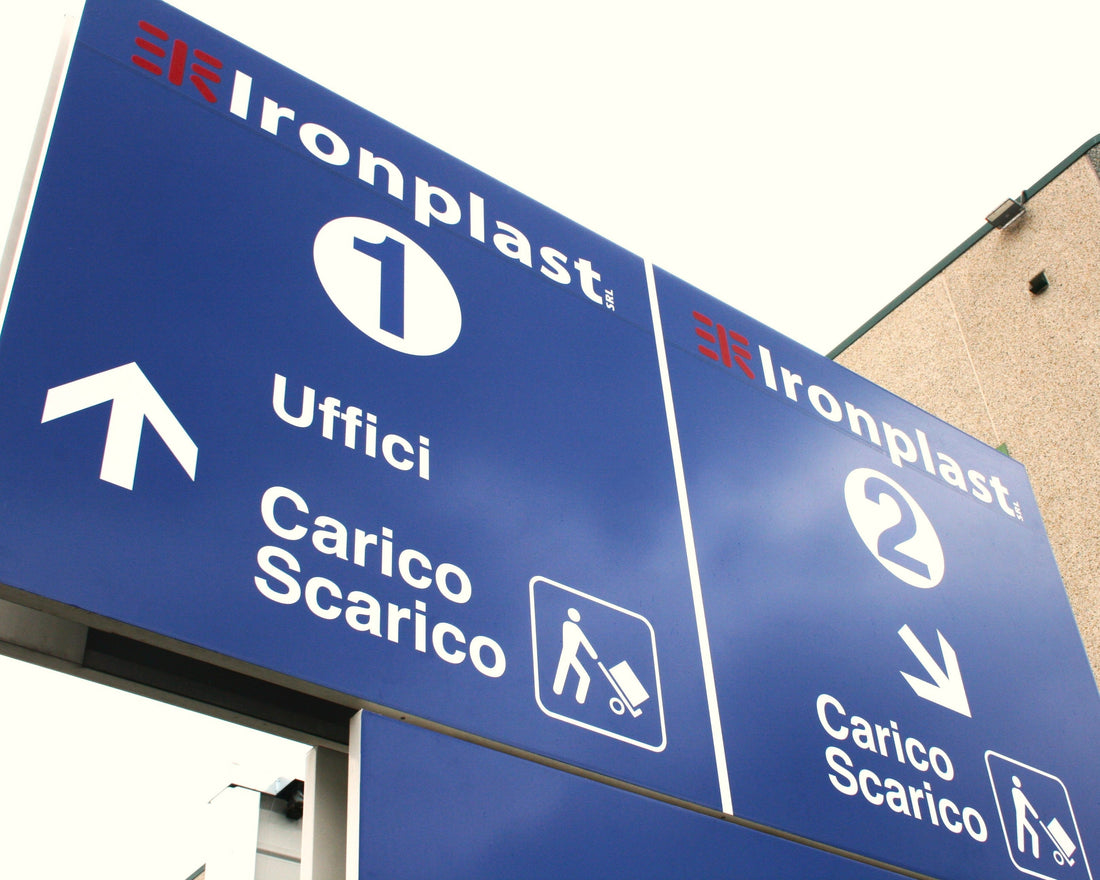
A double-sided totem for orientation and communication
Each side of the totem clearly communicates directional directions :
- Entrance 1 : Offices + Loading/Unloading
- Entrance 2 : Loading/Unloading Only
Intuitive icons and visual layout help you find your way around quickly, even for first-time visitors to the company.

The complete intervention signed ZIPPOPIU
All the work was done internally by ZIPPOPIU :
- Totem design
- Graphic production
- Professional adhesion
- Assembly and final installation
A job done with artisanal care and technical precision .


